Table
Display and interact with structured data in rows and columns.
The <Table> component displays structured data in a grid layout with rows and columns. It provides features for selecting, sorting, editing, and reordering data, making it ideal for applications that need to present and manipulate tabular information.
Use tables when you need to display datasets where users benefit from seeing multiple records at once, comparing values across columns, or performing bulk operations on selected items. Tables work well for admin interfaces, data management screens, and dashboards where structured information needs to be organized and actionable.
Anatomy
- Header (sticky): Container for column headers, can stick to viewport top when scrolling.
- Column: Individual column headers that can enable sorting functionality.
- Selection checkbox: Checkbox for selecting individual rows or all rows at once.
- Row (selectable): Individual table rows that can be selected, clicked, or dragged.
- Cell: Standard cell containing data, text, or components.
- Footer (sticky): Optional summary row rendered after the body, can stick to the viewport bottom when scrolling.
Appearance
The appearance of a component can be customized using the variant and size props. These props adjust the visual style and dimensions of the component, available values are based on the active theme.
Venue | Type | City | Capacity |
|---|---|---|---|
Oak Ridge Barn | Rustic or Alternative Venue | Hee-Haw City, Canada | 150 |
Harborfront Promenade | Outdoor Venue | Port Funsies, United Kingdom | 600 |
Cellar Lounge | Club or Lounge | Laughville, United States | 250 |
| Property | Type | Description |
|---|---|---|
variant | default | grid | muted | admin | master | The available variants of this component. |
size | compact | default | spacious | The available sizes of this component. |
The Table component offers different visual styles to match your use case and data density.
| Variant | Description | When to use |
|---|---|---|
default | Standard table appearance with clean, clear data presentation. | Most use cases where data needs to be presented in a straightforward way. |
muted | Reduces visual noise with a subtle header background. | Tables with extensive content where users need to focus on the data. |
grid | Adds vertical borders between columns for clearer separation. | Tables with many columns or dense data that benefit from visual column separation. |
admin | Highlights rows relevant to admin users. Learn more. | Marking content that is only visible or relevant to admin users. |
master | Highlights rows relevant to master users. Learn more. | Marking content that is only visible or relevant to master users. |
Usage
Tables organize information into a grid structure that makes data easy to scan, compare, and act upon. Use tables when you need to present multiple records with consistent attributes, allow users to select and perform actions on items, or enable sorting and filtering of large datasets.
The Table component supports various interaction patterns including row selection for bulk operations, column sorting for data organization, inline editing for quick updates, and drag and drop for manual reordering. Choose the features that match your use case without overwhelming users with unnecessary functionality.
Displaying data
When you need to present structured information in a clear, scannable format, use tables to organize data into rows and columns. Each row represents a record, and each column represents an attribute of that record.
Do
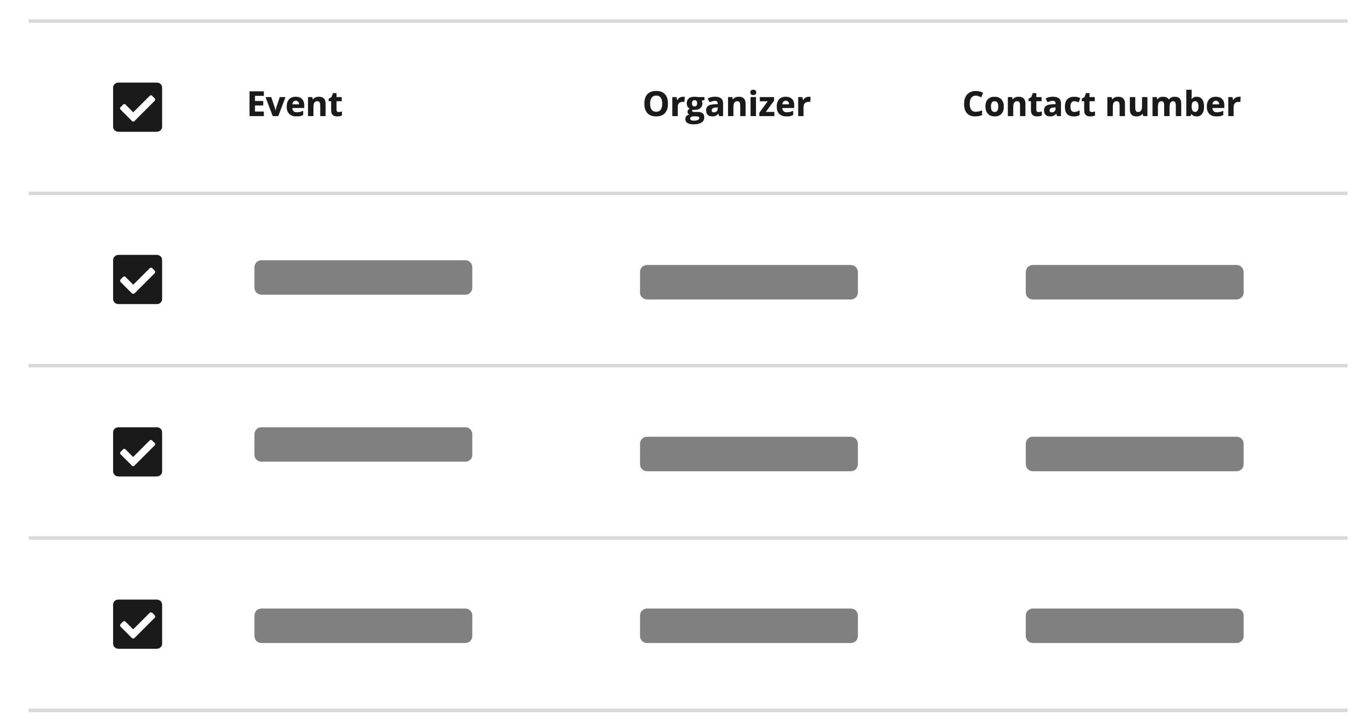
Provide descriptive column headers for each column that accurately represent the data.
Don't
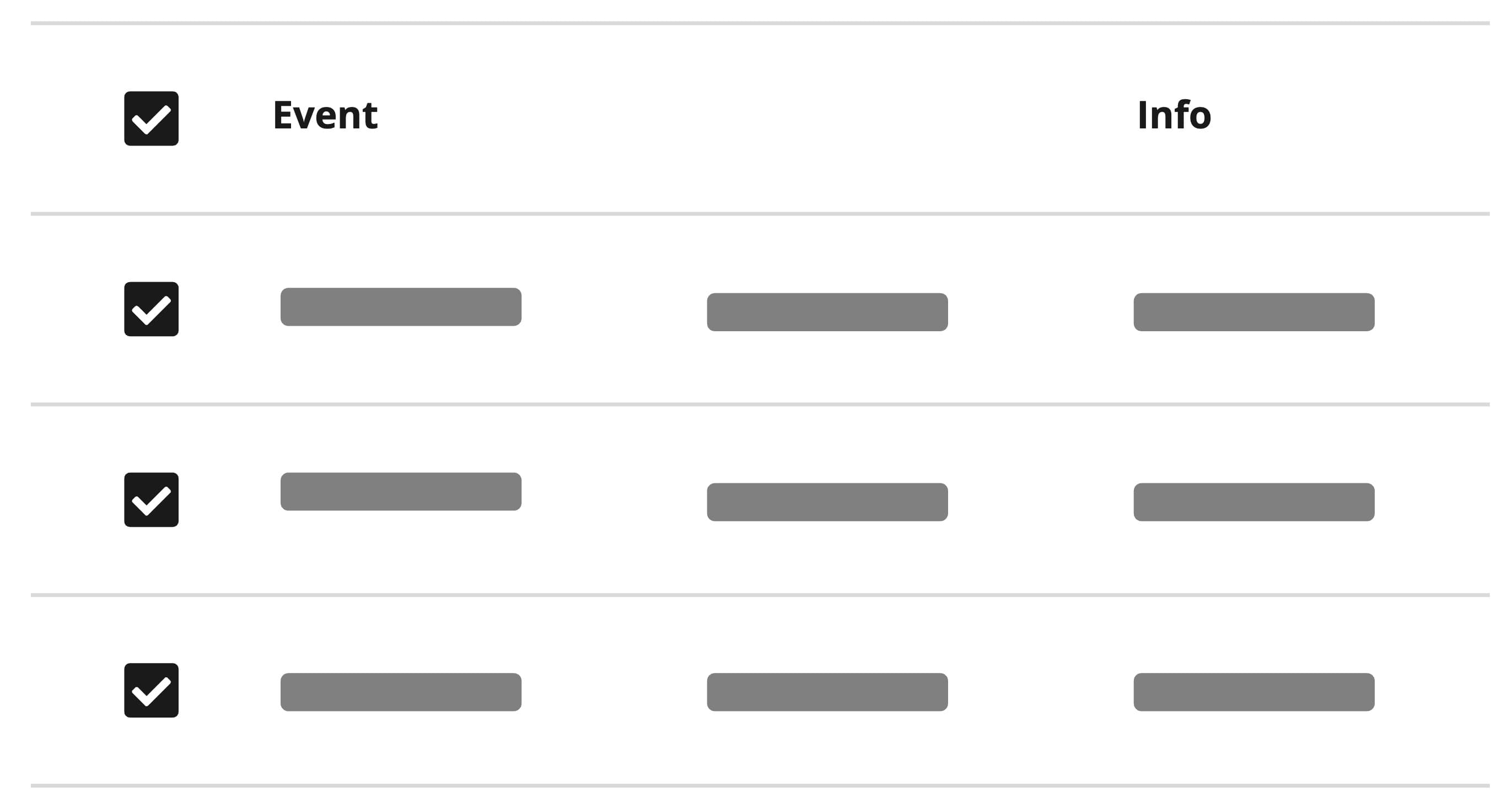
Avoid using vague or misleading column headers that do not clearly represent the data.
When cell content exceeds the available column width, consider truncating text to maintain table scannability and consistent row heights. Truncation works best for columns with long text values like descriptions, addresses, or notes where seeing the full content isn't critical for initial scanning.
For columns where users need to read the complete value (like names, IDs, or status) avoid truncation or provide the full text on hover using a tooltip. Balance readability with density by ensuring the most important columns display their full content while less critical columns can be truncated.
Venue | Description | Rating |
|---|---|---|
Main Street Park Amphitheater | An open-air amphitheater in the town park with lawn seating and a covered stage, ideal for community performances and summer comedy nights. | 4.7 |
Shakytown Comedy Club | A cozy comedy club in the heart of Shakytown, offering an intimate atmosphere where every seat is close to the laughter. | 3.6 |
Oak Ridge Barn | A restored timber barn with modern amenities, ideal for rustic weddings, small concerts, and community gatherings. | 2.3 |
Harborfront Promenade | A scenic waterfront promenade with a raised stage and open lawn, perfect for sunset events and outdoor performances. | 4.2 |
Cellar Lounge | An intimate basement lounge with low lighting and great acoustics, suited for stand‑up, small bands, and late‑night sets. | 3.1 |
Align content
Proper alignment makes data easier to scan and compare. Different data types benefit from different alignments. Here are some general rules when to apply which alignment:
Horizontal alignment:
- Left (default): Text content like names and descriptions for natural reading flow
- Right: Numeric values so decimal points and place values line up vertically
- Center: Icons or status indicators (use sparingly)
Vertical alignment:
- Top: Best for unpredictable row heights or prioritizing top-down reading flow
- Center (default): Balances content when most cells have similar heights
- Bottom: Aligns text baselines or groups elements at the bottom edge
Venue | Nights | Guests | Price/Night | Subtotal |
|---|---|---|---|---|
Main Street Park Amphitheater Laughville, United States | 2 | 320 | $1,000.00 | $2,000.00 |
Shakytown Comedy Club Shakytown, United States | 1 | 80 | $750.00 | $750.00 |
Oak Ridge Barn Hee-Haw City, Canada | 3 | 145 | $500.00 | $1,500.00 |
Harborfront Promenade Port Funsies, United Kingdom | 1 | 9 | $2,000.00 | $2,000.00 |
Total | $6,250.00 | |||
Column widths
A column without a width falls back to react-aria's 75px minimum, so a narrow container squeezes every column down to that floor. Cell content that cannot shrink then paints outside its own cell, because cells do not clip. Give columns a width to keep the table a predictable size:
- A fraction (
2fr,1.5fr) for text columns that should absorb the space left over, like names, addresses or descriptions. - A number for columns whose content has a predictable size, like a badge, a date or a row action.
minWidthon fraction columns, to set the width at which the column stops shrinking. A staticwidthis its own floor already and needs nominWidth.
Those floors added together are the smallest width the table can take. Where that can exceed the space available, wrap the table in a <Scrollable> so the columns stay reachable instead of being clipped by the page.
Venue | Address | City | Capacity | Rating |
|---|---|---|---|---|
Main Street Park Amphitheater | 123 Main Street, 12345 | Laughville | 500 | 4.7 |
Shakytown Comedy Club | 456 Comedy Boulevard, 54321 | Shakytown | 300 | 3.6 |
Oak Ridge Barn | 789 Oak Road, 78901 | Hee-Haw City | 150 | 2.3 |
Harborfront Promenade | 101 Riverside Drive, 10101 | Port Funsies | 600 | 4.2 |
Cellar Lounge | 202 Buzzington Street, 20202 | Laughville | 250 | 3.1 |
A table without a scroll container has to fit its container at every width, so keep its floors low: fraction widths on their own divide up the available space without raising the minimum.
Selecting rows
When users need to perform actions on multiple items at once, enable row selection. This allows users to select individual rows or all rows, then perform bulk operations like delete, export, or modify. The Bulk Actions pattern describes the complete flow from selection to result feedback, including the <ActionBar> that carries the actions.
Row selection is particularly valuable in scenarios where users manage multiple records simultaneously, such as bulk deleting outdated entries, exporting selected data for reports, moving items between categories, or applying changes to multiple records. The selection mechanism provides visual feedback through checkboxes and highlights the selected rows to maintain clear context of what will be affected by subsequent actions.
The Table component supports two selection modes:
- Multiple selection: Users can select any number of rows using checkboxes. Click individual checkboxes to select specific rows, or use the header checkbox to select all rows at once. This mode is ideal for bulk operations where users need flexibility in choosing which items to act upon.
- Single selection: Users can select only one row at a time by clicking anywhere on the row. Selecting a new row automatically deselects the previous one. Use this mode when actions apply to only one item, like viewing details or editing a single record.
Venue | Type | City | |
|---|---|---|---|
Oak Ridge Barn | Rustic or Alternative Venue | Hee-Haw City, Canada | |
Harborfront Promenade | Outdoor Venue | Port Funsies, United Kingdom | |
Cellar Lounge | Club or Lounge | Laughville, United States |
Do
Use multiple selection when users need to perform bulk operations on several items.
Do
Show the number of selected items and available actions clearly.
Row Actions
Row actions let users interact with individual records directly from a table, such as editing, viewing details, or triggering specific operations. These interactions are essential for working with tabular data, and thoughtful design helps users stay oriented and confident. To support clarity, predictability, and efficiency, it's important to align how and where these actions appear.
Use the <Button> component with the secondary (default) variant for row actions. If the action is destructive, use the destructive variant instead. In both cases, apply the small button size to maintain visual consistency and minimize visual noise in dense table layouts.
When it comes to placement, always position row actions at the end of the row. This improves scannability and clearly signals which parts of the row are interactive, helping users quickly locate available actions.
Venue | Address | Rating | Action |
|---|---|---|---|
Main Street Park Amphitheater | 123 Main Street, Laughville | 4.7 | |
Shakytown Comedy Club | 456 Comedy Boulevard, Shakytown | 3.6 | |
Oak Ridge Barn | 789 Oak Road, Hee-Haw City | 2.3 |
Show only the most important 1 to 3 actions per row. These should be the actions users are most likely to need or expect to find without having to open a menu, such as "Edit" or "View." If you need to support more than three actions, prioritize them by frequency and importance: display the most critical ones directly, and group the rest into a contextual menu using an <ActionMenu> (see ActionMenu). This keeps the row clean and scannable while still offering access to all necessary actions.
Using too many visible actions at once can overwhelm users, make it hard to identify what to do, and increase visual clutter. If space is limited or the layout feels crowded, consider using icon buttons to keep actions compact. Pair them with tooltips to clearly communicate each action's purpose without adding visual noise.
Use icons with care
Only use icons when their meaning is clear without explanation. If the icon might be ambiguous, prefer a labeled button or add context with a tooltip.
Venue | Address | Rating | Action |
|---|---|---|---|
Main Street Park Amphitheater | 123 Main Street, Laughville | 4.7 | |
Shakytown Comedy Club | 456 Comedy Boulevard, Shakytown | 3.6 | |
Oak Ridge Barn | 789 Oak Road, Hee-Haw City | 2.3 |
If you cannot place all row actions at the end of the row, be mindful of clarity and consistency. Actions should remain visually distinct from content and navigation, and be grouped where possible to support scannability. Apply consistent styling to each action and avoid placing them in unexpected locations, as this can increase cognitive load and make it harder for users to understand what they can do in each row.
Do
Place row actions at the end of the row for consistent scannability.
Limit visible actions to 1 to 3 per row and group the rest in an ActionMenu.
Don't
Don't display too many actions per row, as it creates visual clutter and overwhelms users.
Don't use icon-only buttons when the icon's meaning is ambiguous without a label.
Grouped rows
When a record contains records of its own, like a settlement run that bundles individual clearings, users still need to read those children against the same columns as everything else. Grouped rows keep them in the table instead of moving them into a detail view, and each child stays a row in its own right, with its own actions and its own selection.
Let the hierarchy sit on the column that identifies the row, usually the first one, and leave the rest of the columns as they are. The expand control, the indentation and the emphasis on a group row come with it, so there is nothing to place or style.
Groups open collapsed, which makes the group row the only thing most people will read of a group. Give it values of its own rather than an empty row above its children: a total, a count, a status that summarises what is inside. Where a value has no summary, leave the cell empty instead of repeating the first child.
Clearing no. | Invoice no. | Event | Amount | Actions |
|---|---|---|---|---|
Settlement run 1 Jul 2026 | €12,500.00 | |||
CLR-10231 | INV-4711 | Night market | €4,200.00 | |
CLR-10232 | INV-4712 | Summer party | €8,300.00 | |
Settlement run 1 Jun 2026 | €4,500.00 | |||
CLR-10240 | INV-4720 | City tour | €990.50 |
Children that load on demand
A group whose children you fetch only once someone opens it has nothing under
it at first render, so it gets no expand control and there is nothing to press
that would start the fetch. Mark the row expandable to give it a control
before its children exist, then load them in onExpandedChange. Rows you pass
in up front work this out on their own.
Do
Keep the hierarchy shallow. One level of grouping is almost always enough in a data table.
Don't
Don't use grouped rows for content that isn't tabular. Reach for an Accordion when the expanded content doesn't share the table's columns.
Sorting columns
When working with large datasets, users often need to organize information by specific attributes to find what they're looking for or identify patterns. Sorting solves the problem of information overload by letting users reorder data in a way that makes sense for their current task, whether that's finding the highest value, the most recent date, or items alphabetically.
Enable sorting to let users click column headers and dynamically reorder rows by that column's values. This is particularly valuable when users need to:
- Find extremes: Quickly locate the highest price, earliest date, or longest duration
- Compare values: See how items stack up against each other when ordered by a specific metric
- Identify patterns: Spot trends, outliers, or groupings that emerge when data is organized
- Prioritize work: Focus on urgent items by sorting by deadline or status
Venue | Capacity | Rating | Description |
|---|---|---|---|
Main Street Park Amphitheater | 500 | 4.7 | An open-air amphitheater in the town park with lawn seating and a covered stage, ideal for community performances and summer comedy nights. |
Shakytown Comedy Club | 300 | 3.6 | A cozy comedy club in the heart of Shakytown, offering an intimate atmosphere where every seat is close to the laughter. |
Oak Ridge Barn | 150 | 2.3 | A restored timber barn with modern amenities, ideal for rustic weddings, small concerts, and community gatherings. |
Harborfront Promenade | 600 | 4.2 | A scenic waterfront promenade with a raised stage and open lawn, perfect for sunset events and outdoor performances. |
Cellar Lounge | 250 | 3.1 | An intimate basement lounge with low lighting and great acoustics, suited for stand‑up, small bands, and late‑night sets. |
Grand Avenue Ballroom | 800 | 5.0 | An elegant ballroom with crystal chandeliers and a full proscenium stage, ideal for gala dinners, award nights, and concerts. |
Maple Court Theatre | 400 | 4.4 | A comfortable mid‑size theatre with raked seating and modern AV, designed for comedy, theatre, and lectures. |
Broadway Community Center | 350 | 3.8 | A multipurpose community center with flexible rooms and a small auditorium for talks, classes, and local performances. |
Hillcrest Open Pavilion | 450 | 2.9 | An open‑air pavilion with a covered stage and movable seating, set in a hillside park for fairs and seasonal shows. |
Do
Enable sorting on columns with comparable data like numbers, dates, or alphabetical text.
Don't
Don't make every column sortable if some contain non-comparable content like icons or actions.
Editing
A table can be edited in place in two ways, and the one that fits follows from the shape of the task rather than the amount of data. Reach for editable cells when the table is mostly read-only and the user corrects one value at a time. Reach for a data-entry grid when every row needs the same fields filled in. If you are still weighing those against a drawer or a separate page, the Table record management pattern sets all four side by side.
Editable cells
When users need to make quick edits to individual values without navigating to a separate form, use editable cells. This is particularly effective for small, atomic changes where users need to update a single field across multiple records, like updating product prices, changing task statuses, correcting typos, or adjusting quantities. By allowing edits directly within the table, you keep users in context and reduce friction.
Editable cells always truncate their content, regardless of the table-level overflow setting. This ensures consistent alignment with column headers and matches the single-line nature of the editing controls (TextField, Select, NumberField, etc.).
Venue | Amenities | Rating |
|---|---|---|
Harborfront Promenade | WiFi, Projector, Screen | 4.2 |
Cellar Lounge | WiFi, Bar | 3.1 |
Grand Avenue Ballroom | WiFi, Projector, Screen, Bar, Coat check | 5.0 |
Maple Court Theatre | WiFi, Projector, Hearing loop | 4.4 |
Do
Choose form controls that match the data type (e.g. Select for predefined options, NumberField for numbers, DatePicker for dates).
Don't
Don't make cells editable if editing requires complex validation or multiple related fields. Use a drawer instead.
Data-entry grid
Use this sparingly. It suits one shape of task: bulk, repetitive entry across a bounded set of rows that already exist, where the user's value comes from comparing rows as they type. A grid is a single tab stop, so moving from one field to the next stays a grid movement rather than a single Tab press. The keystrokes add up faster than the table looks, and no table can offer the field-to-field tabbing a form does. A date range, a lookup that opens its own popover, or a field whose validity depends on another field belongs in a drawer instead.
When the task does fit, don't give a whole column editable cells. Put the form controls directly in the cells and let the table be the form. Every row stays visible for comparison while the user types, and nothing has to be opened first. See Filling in many rows at once for the limits on columns and rows, which cells to keep read-only, and how the grid is saved.
Venue | Capacity | Note |
|---|---|---|
Main Street Park Amphitheater | ||
Shakytown Comedy Club | ||
Oak Ridge Barn | ||
Harborfront Promenade |
Set keyboardNavigationBehavior to tab
Form controls in cells need keyboardNavigationBehavior="tab" on the
<Table>. Without it the grid keeps the arrow keys, so pressing one inside a
field moves focus to the row instead of moving the caret. The fields still look
and click fine on the default arrow, which is how the keyboard trap ships
unnoticed.
Reordering
When the order of items matters and users need to manually arrange them, enable drag and drop. This works well for priority lists, custom orderings, or workflows where sequence is important.
Keyboard support and multiple items
Reordering is fully keyboard accessible. Users can also move multiple items at once by selecting them before initiating the drag operation.
Venue | City | ||
|---|---|---|---|
Main Street Park Amphitheater | Laughville, United States | ||
Shakytown Comedy Club | Shakytown, United States | ||
Oak Ridge Barn | Hee-Haw City, Canada | ||
Harborfront Promenade | Port Funsies, United Kingdom | ||
Cellar Lounge | Laughville, United States |
Empty states
When a table has no data to display, whether from empty search results, filters with no matches, or newly created lists, show a helpful empty state instead of a blank table body.
Name | Email | Status |
|---|---|---|
No results foundTry adjusting your search or filters to find what you're looking for. | ||
Do
Include action buttons in empty states when appropriate, like "Add first item" or "Clear filters".
Don't
Don't show a generic "No data" message without context or next steps.
Sticky headers and footers
For tables with many rows that require scrolling, sticky headers keep column labels visible as users scroll through data. This helps users maintain context about what each column represents.
Venue | City | Capacity |
|---|---|---|
Main Street Park Amphitheater | Laughville, United States | 500 |
Shakytown Comedy Club | Shakytown, United States | 300 |
Oak Ridge Barn | Hee-Haw City, Canada | 150 |
Harborfront Promenade | Port Funsies, United Kingdom | 600 |
Cellar Lounge | Laughville, United States | 250 |
Grand Avenue Ballroom | Shakytown, United States | 800 |
Maple Court Theatre | Hee-Haw City, Canada | 400 |
Broadway Community Center | Port Funsies, United Kingdom | 350 |
Hillcrest Open Pavilion | Laughville, United States | 450 |
Bloomfield Garden Lawn | Shakytown, United States | 1,000 |
Do
Use sticky headers for tables with more than 10-15 rows where scrolling is necessary.
Don't
Don't make headers sticky for short tables where all rows fit on screen without scrolling.
Table footers can be sticky too, keeping the summary row visible while users scroll through long tables.
Venue | City | Capacity |
|---|---|---|
Main Street Park Amphitheater | Laughville, United States | 500 |
Shakytown Comedy Club | Shakytown, United States | 300 |
Oak Ridge Barn | Hee-Haw City, Canada | 150 |
Harborfront Promenade | Port Funsies, United Kingdom | 600 |
Cellar Lounge | Laughville, United States | 250 |
Grand Avenue Ballroom | Shakytown, United States | 800 |
Maple Court Theatre | Hee-Haw City, Canada | 400 |
Broadway Community Center | Port Funsies, United Kingdom | 350 |
Hillcrest Open Pavilion | Laughville, United States | 450 |
Bloomfield Garden Lawn | Shakytown, United States | 1,000 |
Total | 4,800 | |
Display totals
Use <Table.Footer> to display a summary row after the table body, such as totals, counts, or averages. Unlike faking a totals row with an extra <Table.Row> inside the body, the footer renders as a semantic <tfoot>, which keeps it out of the body's scroll and sticky-header semantics and is announced correctly by assistive technology.
Compose the summary row from <Table.Row> and <Table.Cell> just like the body, using colSpan to span a label across multiple columns.
Venue | City | Capacity |
|---|---|---|
Main Street Park Amphitheater | Laughville, United States | 500 |
Shakytown Comedy Club | Shakytown, United States | 300 |
Oak Ridge Barn | Hee-Haw City, Canada | 150 |
Harborfront Promenade | Port Funsies, United Kingdom | 600 |
Cellar Lounge | Laughville, United States | 250 |
Total | 1,800 | |
Do
Use a footer for a single, table-wide summary row like totals or counts.
Don't
Don't use a footer to add another data row, use <Table.Body> for
records.
Text selection
Text selection is disabled by default to avoid interaction complexity. When enabled, users must distinguish between clicking to select a row versus clicking to select text. Enable text selection when users frequently need to copy cell content like emails, IDs, or reference numbers. Row selection will still work through checkboxes while allowing users to select and copy text within cells.
Did you know?
Users can triple-click on a text to quickly select the whole content.
Venue | Type | |
|---|---|---|
Main Street Park Amphitheater | Outdoor Venue | |
Shakytown Comedy Club | Club or Lounge | |
Oak Ridge Barn | Rustic or Alternative Venue | |
Harborfront Promenade | Outdoor Venue |
Do
Enable text selection when users frequently need to copy data like IDs, emails, or reference numbers.
Don't
Don't enable text selection by default, as it adds interaction complexity most tables don't need.
Row header
By default, screen readers announce only the content of the focused cell when navigating a table with the keyboard. This can make it difficult for users to understand which row they are in, especially in tables with many columns.
Setting rowHeader on a column tells assistive technology to announce that column's cell value alongside any other cell the user navigates to in the same row. For example, if a "Name" column is marked as a row header, a screen reader will announce "Name: Alice, Email: alice@example.com" instead of just "alice@example.com" when the user moves to the email cell.
Mark the column that best identifies each row, typically a name, title, or ID column. Every table should have at least one row header to ensure users relying on assistive technology can orient themselves within the data.
<Table.Header>
  <Table.Column rowHeader>Name</Table.Column>
  <Table.Column>Email</Table.Column>
</Table.Header>
Accessibility
A table with grouped rows reports itself as a treegrid instead of a grid, which is what lets screen readers announce how deep a row sits and whether it is expanded. Tests that query getByRole('grid') have to move to getByRole('treegrid').
Group rows expand with → and collapse with ←. The expand control stays out of the tab order, so Tab keeps moving between the buttons and links inside the rows.
Props
Table
Prop
Type
Accessibility props (4)
Prop
Type
DOM event handlers (64)
Prop
Type
Table.Header
Prop
Type
DOM event handlers (64)
Prop
Type
Table.Column
Prop
Type
DOM event handlers (64)
Prop
Type
Table.Body
Prop
Type
DOM event handlers (64)
Prop
Type
Table.Row
Prop
Type
DOM event handlers (63)
Prop
Type
Table.ExpandableRows
Prop
Type
Table.Cell
Prop
Type
DOM event handlers (64)
Prop
Type
Table.EditableCell
Prop
Type
Table.Footer
DOM event handlers (64)
Alternative components
Choosing the right alternative to data tables is crucial for effectively displaying your data and enhancing user interaction. Depending on the type of data and the desired user experience, different components can offer different benefits. Here are some alternatives to data tables that might better suit your needs:
SelectionList: Displays a list of interactive items, useful to create an actionable list of related items, such as a list of users.
Cards: Helpful if the data needs to be displayed with more visual hierarchy. Keep in mind that you can't compare data in this way not as good as tables, because the eyes have to move much more.
List: When presenting a simple, linear collection of items, often with less data per item. Easy to read and navigate, especially for data that doesn't require complex organization.
Grid: Layout in a table-like structure. This gives you full control over the size of the columns and rows and allows you to align them according to your needs.
Columns: Create columns in one row, useful if you need to align content in a table-like way with fewer rows.
Is there still not the right alternative for you please get in touch with us!