Pick
Find and collect records from a collection, then commit them as a set.
Some tasks are not about narrowing what is already on screen. They are about going to a collection, finding the right records, and bringing a chosen few back into the task at hand. Adding performers to an event, choosing venues for a report, granting a set of users access: each starts from nothing selected and ends with a committed set. This is picking, and it is a different pattern from filtering.
Filter vs Pick
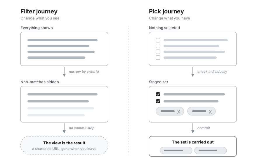
The two look alike because both use a search field and both end in a smaller set. The difference is the mechanism. Filtering narrows a visible dataset by criteria, and the narrowed view is the result. Picking enumerates individual records from a collection and commits them, and the committed set is the result, carried somewhere else. One question separates them: how does the smaller set come about? If the user sets criteria such as type, date, or status, it is a filter. If the user checks individual records one by one, it is a pick. One case looks deceptive: ticking values in a facet filter, such as brand, size, or category, feels like checking records off one by one, but those values are criteria, so it stays a filter.
| Aspect | Filter | Pick |
|---|---|---|
| Result | The same collection with non-matches hidden. The view is the answer. | A committed set of records, used somewhere else. |
| Mechanism | Narrow by criteria. Everything is shown by default. | Enumerate individual records. Nothing is selected by default. |
| Commit | Continuous and reversible, with no point of no return. | An explicit step. Cancelling discards the whole set. |
| Modality | Usually non-modal, the view stays in place. | The heavier the pick, the more it leans modal or takes its own surface. |
| Destination | The URL as query state, gone once you leave. | The host task, as a shareable URL or a saved record. |
One picture keeps them apart. Filtering is turning a camera lens, you change what you see and the collection itself stays put. Picking is filling a basket, you change what you have and leave with it.
When not to use a pick
Picking is for choosing records, not changing them. To create or edit a record's fields, use a drawer as described in the Table Records pattern. To narrow a dataset that is already on screen, use the Filter pattern. And to act on rows the user is already looking at, stay on the page with the filter, select, act approach below rather than opening a dialog.
Choose the surface by collection size
Reach for a pick when the user has to assemble a set of records that lives somewhere other than the current screen. The records may be too many to show inline, they may sit in a separate collection, or choosing them may deserve its own focused space. Every pick has the same shape: it begins with nothing selected, the user finds and stages records, and it ends when they commit the set or discard it.
The dialog is the default, but it is only one point on a spectrum. As the collection grows and the choice carries more weight, the right surface moves with it. Do not reach straight for a modal. Match the surface to how much picking the task really involves.
| Situation | Surface | Why it fits |
|---|---|---|
| A few options that are already on the page | Inline multi-select, the Multiple Selection pattern | The options are already in front of the user, so anything heavier only adds clicks. Reach for this first. |
| A longer list that can still stay on the page | Searchable field, a <TagField> | The field opens a popover of matches as the user types and shows the chosen ones as tags, all without leaving the page. |
| A real find-and-collect task | Dialog, the default | Room for search, filters, a selectable list, and a commit footer, focused over the page without navigating away. Scales from large to fullscreen as the table grows. |
| A pick that needs its own place | Routed page, the exception | Use it when the pick needs its own URL, appears in several places, or is used often. A pick that is merely large fits a size="fullscreen" dialog first. |
The direction is the through-line: keep the pick on the page while you can, move to a dialog once it becomes a task in its own right, and leave the page only when even a fullscreen dialog is not enough.
One surface sits to the side of this progression: a transfer list, two panes with available records on the left and chosen ones on the right. It fits a pick where the user wants to watch the whole selection build up beside the source, but it is space-hungry and rarely earns its cost, so use it sparingly. Marigold has no dedicated component for it yet, so today it is a hand-built layout rather than a ready surface.
Staying on the page comes in two shapes, and the right one depends on how the options are best shown. A searchable field suits a collection the user knows by name and long enough that scrolling would be slower than typing. An inline list suits a set short enough to show in full, and it wins whenever the user needs to see every option and its state before choosing.
The searchable-field shape: a <TagField> picks the performers for an event. Type to filter the roster, choose from the popover, and each pick becomes a removable tag. The selection is the committed set, so there is no separate commit step and the user never leaves the page.
The inline-list shape shows every option at once, which is exactly what some picks need. Here the user assembles a season subscription, an Abonnement, from a concert series: each date shows its time and venue, and sold-out dates are visibly disabled, so the user sees what is gone before choosing rather than discovering it in a search. The set is short enough to sit on the page, so the whole pick, the list and its commit, happens in place.
Sizing a heavy pick
A size="large" <Dialog> gives about 640px of
height and 1024px of width on desktop, room enough for a search field, a
scrollable list, and a footer. When a pick carries a wide table or many rows
that a large dialog would cramp, size="fullscreen" fills the viewport, as
the example does. Use a routed page only when the pick needs
its own URL or appears in several places. A pick that is simply large belongs
in a fullscreen dialog.
The pick dialog
The dialog is the pattern's default surface and the most composed, so it is worth walking through part by part. It gathers a pick into one focused place that floats over the page rather than navigating away, its parts stacked in a predictable order from the trigger that opens it down to the footer that ends it.
A trigger in the host task opens the dialog, such as an "Add venues" button, and nothing is staged until the user opens it and commits. Inside, a title names what is being picked, such as "Select venues". Below the title, a <SearchField> finds records by name as the user types and narrows the visible rows without touching what is already staged. Optional filter controls sit beside it, criteria such as status or type that slice a large pool further.
The matching records form the results collection, shown as a <Table> when they carry detail worth scanning, such as a city and a capacity, or a plain list when the label is all there is. Checking a row stages it. A commit footer ends the task, where a cancel action discards the staged set and a primary action commits it, carrying the staged count in its label, "Add 3 venues".
The example below adds venues from a searchable, filterable, multi-select table.
A few details make the dialog trustworthy:
- Never clear staged selections while filtering. Typing in the search narrows the visible rows, but records staged earlier stay staged even when they scroll out of view. Clearing them on every keystroke would make the pick impossible. This is the same tension as the filter paradox in Table Records.
- Show records the way the user recognizes them. When a record carries detail worth scanning, such as a city or a capacity, show each attribute in its own
<Table>column instead of a bare name. A plain list is enough when the label stands on its own. - Offer select all for bulk picks. A header control that selects every row, shown in a mixed state while the selection is partial, saves the user from working through a long list by hand. Keep it paired with search and filters so "all" applies to a sensibly narrowed set.
- Cancel discards, commit persists. Closing or cancelling throws the staged set away with no consequence. Only the primary action carries the selection back to the task.
Naming the commit button
The button that ends the pick performs one action: it commits the staged set and hands it to the host task, so label it with that action. A button that names its outcome tells the user what will happen when they press it, the same principle that makes "Add to cart" clearer than "Add" and "Publish" clearer than a dialog's "OK". Neutral words like "Next", "Continue", or "Done" only mark a step or an acknowledgement, so they fit a multi-step sequence rather than a commit, and "Filter" belongs to the Filter pattern, which narrows a view in place instead of committing a set.
Name the outcome with the host task's own verb, so the button says what pressing it does, the same reason a results button reads "Show 82 results" rather than "Show". The verb comes from the task, not the pick: "Add venues" when the set joins a collection, "Assign users" when it grants access, or "Save venues" when the commit writes the set into a record the user keeps and edits, as the example does.
The staged count is status, not the action, so its home is the rail of removable tags that already shows the set. Echoing it in the label, "Add 3 venues", is the clearest default when the count stays short and mirrors the trigger that opened the dialog, "Add venues". Let the rail carry the count alone, and keep the button a bare verb, when the label would run long or when the pick sets a minimum or maximum, since a limit like "3 of 5" reads as a rule beside the set rather than as part of the button's verb.
When nothing is staged, show the bare verb ("Add venues") rather than a clickable "Add 0 venues", and keep the button active. An empty or too-small set is caught on press, not prevented by disabling, as Selection limits describes. When the label does carry the count, compose it by hand from the staged set so the wording and the number never disagree. The <ActionBar> is built for a table's floating bulk actions, not a dialog's commit footer, so it is not the tool for this button.
Do
Name the outcome with the host task's verb, and let the staged-tag rail carry the count. Echo it in the label, "Add 3 venues", when that keeps the button short and mirrors the trigger.
Don't
Don't label the commit with a generic "Next", "OK", or "Done", with "Filter" from the other pattern, or with "Save" for a pick that only feeds a view the user can discard.
Selection limits
Some picks limit how many records the user may choose. Tell them the rule up front, before they hit it. A short line of helper text like "Pick at least three" or "Choose up to seven" sets the expectation, and a running count shows where they stand. Put that count on the staged-tag rail, which already lists the chosen records, so a label like "Staged (3 of 5)" shows the limit without adding a separate control.
A minimum is the fewest the user may pick, and most picks need at least one record. Keep the commit button active even before the set is valid, and check the rule when the user presses it. If the set is too small, do not commit. Show a short message at the top of the surface that says what is still needed, "Pick at least one venue" or "Two more to go". This follows the Button pattern, which asks you to guide with a message rather than a disabled control, because a disabled button gives no reason for the block and drops out of the keyboard tab order. A <SectionMessage> with variant="error" fits. It sits at the top of the picker, the way an error summary does, and announces itself to assistive technology when it appears. Pair it with the up-front helper text so the requirement is known before the user reaches the footer, and clear it the moment the set becomes valid. The example does this, refusing an empty commit and saying why instead of disabling the button.
A maximum is the most the user may pick. Show the limit before they reach it. Once they hit it, disable the rows they have not picked so they cannot add more, and say why, so the block reads as a rule and not a bug. Let them remove a choice at any time, even at the limit, so they can swap one for another instead of getting stuck.
List or table
Not every pick needs a table. When you choose a record by its name, with at most a supporting line and no grid of comparable detail to scan across rows, a <SelectList> is the lighter collection: a multi-select list, checked to stage and committed the same way. An option can still carry a little more than a bare label, such as a name over an email, and it stays a list. Reach for a <Table> only once the records carry several attributes worth comparing side by side.
Only the collection changes. This pick grants a set of people access and carries the same search, filter, removable staged-tag rail, and empty state as the venue dialog above. What differs is the results collection: a list of people, each a name over an email, instead of a table, since there is no grid of per-row detail to compare.
Filters and empty states
Search alone gets slow once the pool is large, so filter controls sit beside it, narrowing the visible rows without disturbing the staged set.
The danger is that narrowing can empty the list, and an empty table reads as "everything is gone." A count in the footer says how many are staged but not which, so do not lean on it alone. Keep the staged set visible as items. The demo above does this with a rail of removable tags that persists through every search and filter, so the user sees their picks survived and can drop any that no longer belong. Pair it with an empty state on <Table.Body> that says the staged set is intact instead of showing a blank table. If the source collection is empty from the start, say so at the trigger, or disable it, so the user never opens a dialog onto nothing.
Large and async collections
A pick can face hundreds or thousands of records that should not all sit in the browser at once. The instinct is to paginate, but pagination is a tool for browsing a large dataset, not for picking from it. It splits the collection into discrete pages, while a pick has to accumulate a set across the whole collection, so the staged selection ends up spread over pages the user cannot see. That is the "act only on what you can see" risk the Bulk Actions pattern guards against, and a pick cannot resolve it the way bulk actions do, by clearing the selection on every page change, because accumulating the set is the whole point.
So do not paginate the picker. Narrow it instead:
- Lead with search and filters. They cut a large pool down to a set small enough to scan, which paging never does.
- Scroll what remains. Put the results in a bounded
<Scrollable>region so the search, the staged tags, and the commit footer around it stay fixed while only the results scroll. When those results are a<Table>, make its<Table.Header>sticky so the column labels stay visible too. - Fetch on search for large or remote collections. Load matches as the user types rather than pulling the whole collection down, and show a loading state while they arrive. The Async Data Loading pattern covers
useAsyncListand search-as-you-type.
Whatever the source size, track the staged picks independently of the loaded rows, so they survive scrolling, filtering, and re-fetching. The example keeps its venues (about fifty across Germany, Austria, and Switzerland) in a scrollable, sticky-header table narrowed by search alongside type, region, and status filters, with a running result count. The table is wide, eleven columns from region and setting through rating, capacity, and day rate, so it opens in a size="fullscreen" dialog that fills the viewport, the surface this width and density needs. A size="large" dialog would leave the table scrolling sideways. Anything staged stays in a tag rail and commits on confirm, even after it scrolls out of view or a filter hides it.
Filter, select, then act
Sometimes the records are already on the page and the user only needs to act on a few of them. There is no separate collection to visit, so opening a dialog would be a detour. Keep the user on the page: let them filter the table down, select the rows that matter, and act through an <ActionBar>.
At that point you have crossed from picking into the Bulk Actions pattern, and the two are easy to confuse because they share a mechanism: both enumerate records one by one rather than narrowing by criteria. What separates them is what the selection is for. A pick gathers a set and carries it into another task, such as a report or an event's line-up, so the set is the deliverable and it outlives the selection. Bulk actions run an operation on the selected records themselves, such as archive or assign, so the operation is the deliverable and the selection is cleared once it finishes.
Event | Date | Status | |
|---|---|---|---|
Summer Open Air | Jul 12, 2026 | On sale | |
Indie Night | Aug 03, 2026 | On sale | |
Jazz Matinee | Aug 20, 2026 | Draft | |
Comedy Slam | Sep 05, 2026 | On sale | |
Classical Gala | Sep 19, 2026 | Draft | |
Techno Marathon | Oct 02, 2026 | On sale | |
Folk Festival | Oct 15, 2026 | Draft | |
New Year Concert | Dec 31, 2026 | On sale |
The flow lives here only as a signpost. When the selection is for operating on the records rather than gathering them to use elsewhere, stay on the page and follow Bulk Actions, which covers selection scope, confirmation, progress, and partial-failure feedback in full.
After the selection
The commit hands the set back to the host task, which has to show it. Echo the chosen records where the pick was triggered, as a rail of removable <Tag.Group> tags or a short list, so the result stays visible without reopening the dialog. Removing a tag drops that record in place, while the trigger becomes an "Edit selection" button that reopens the pick with the set already staged. Because it reopens staged rather than empty, editing a pick feels the same as making one. The venue demo above does both.
A committed pick has an afterlife, and the two kinds need different care.
- A transient view. The pick produces a view that lasts only as long as the user looks at it, such as a filtered dashboard built from the chosen records. Encode the picked IDs in the URL so the view is shareable and survives a refresh, and let the user discard it freely. Nothing is lost by leaving.
- A persisted record. The pick is written into something durable, such as a report that freezes the chosen records or a group whose membership is saved. Here leaving does lose work, so confirm before discarding staged changes and make the commit deliberate.
The difference is not in the pick itself. The surface and the mechanism are the same. It is in what happens to the set afterward, which is why one pattern serves both.
Demo
The example is a report that owns its picked venues: choose venues and the committed set persists as the report's content, ready to re-open and edit.